brief us button

BRIEF US!

Design illuminating activations around the world with us.

BRIEF US!
Please be sure to enter your frequently used e-mail address.
Please limit your response to 100 words or under. (0 /100)
layer popup

THANK YOU FOR YOUR REQUEST

Thank you very much for your interest in EIDETIC MARKETING.
We look forward to working with you.
We will contact you soon.Thanks Again.

popup

THERE WAS A PROBLEM WITH YOUR SUBMISSION.

Have you checked all the required fields?

We want you to write your Company, Name, E-mail, Budget, Country to Execute, Website URL, Wanted Services and Project Description.Thanks.

Brand Identity Renewal

Integrated Branding

PENTAHEAL Brand Identity Renewal

Integrated Branding

Project Background

PENTAHEAL Clinic is a Korean medical clinic specializing in functional medicine, with a biology-based approach to identifying the root causes of disease.
Functional medicine is an unfamiliar medical field, not yet widely known in Korea. However, Pentaheal Clinic aims to promote functional medicine as a new medical field not only in Korea but throughout Southeast Asia.
To stimulate this medical philosophy and meet the global need of patients, the advancement of visual language needed to evolve to a more universal and straight-forward one. To accomplish this, integrated rebranding was needed.

Related Keywords
#Branding Marketing #Brand Design #Brand Identity #Branding #Brand Marketing Agency #Global Branding #Clinic #Functional Medicine #Health #Medical #Signage

Executed Region
#Korea, Seoul

Our Solution

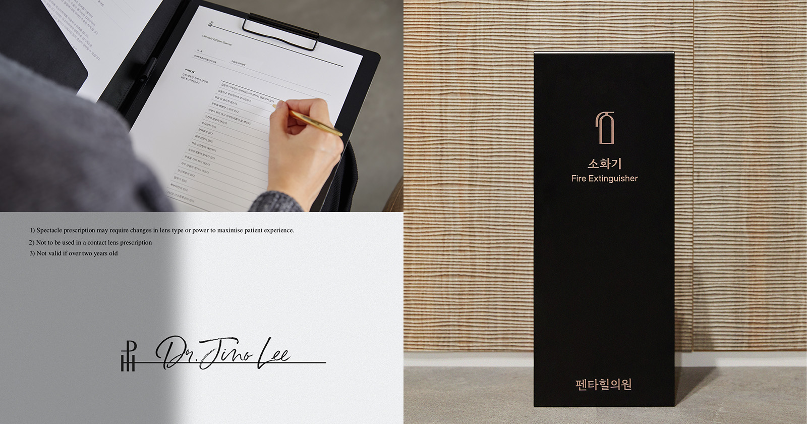
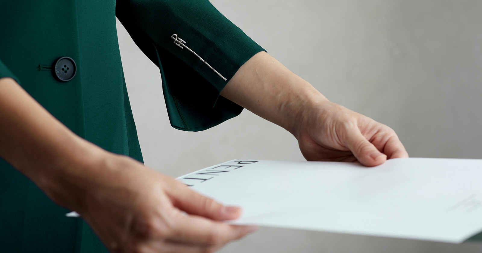
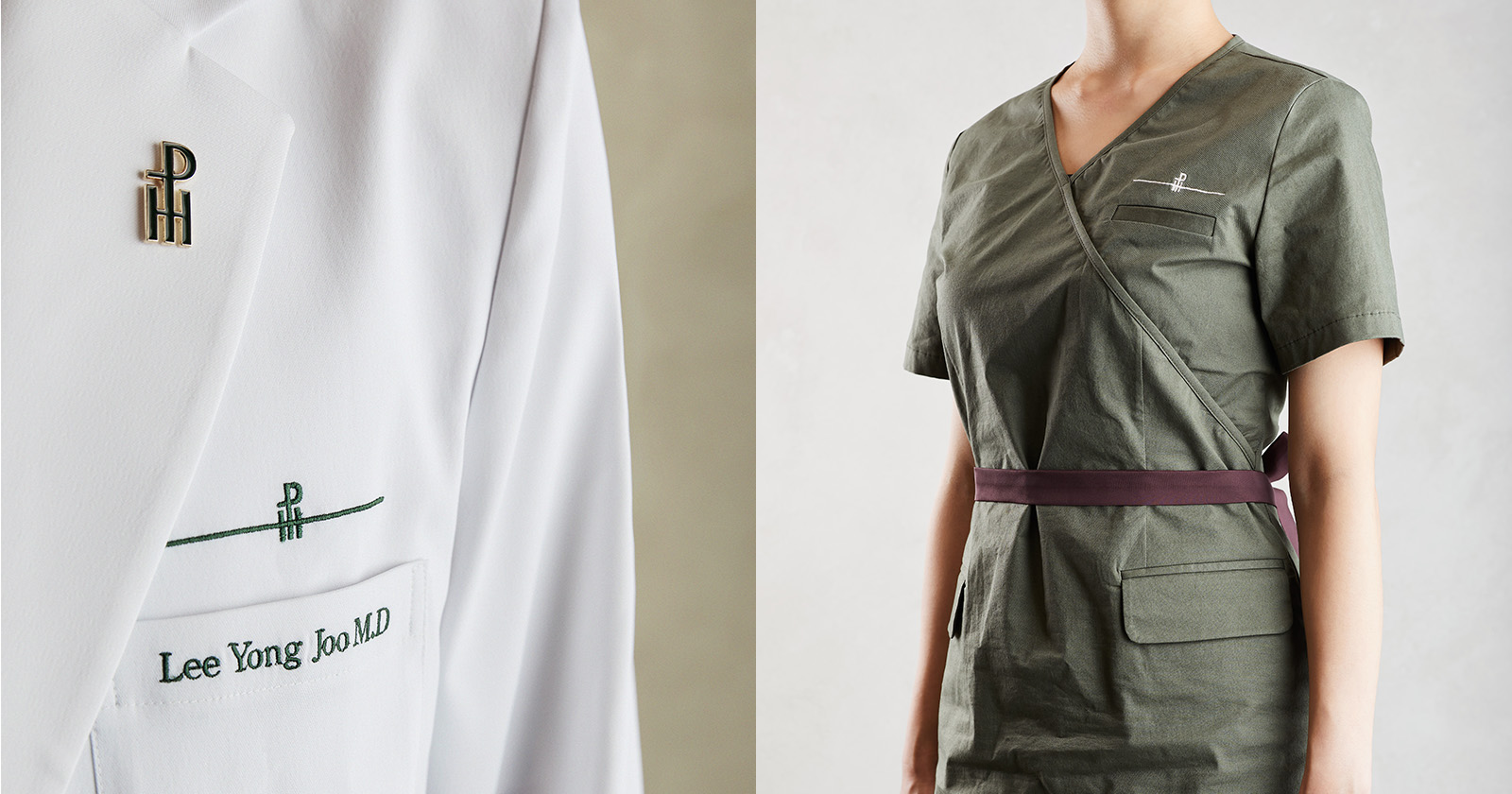
EIDETIC proposed a solution that would maintain Pentaheal’s clinical image and improve the brand’s identity with better readability and suitability. Since the field of functional medicine is not well known in Korea yet, we developed a consistent brand design that would deliver and communicate Pentaheal’s philosophy to the vast public.
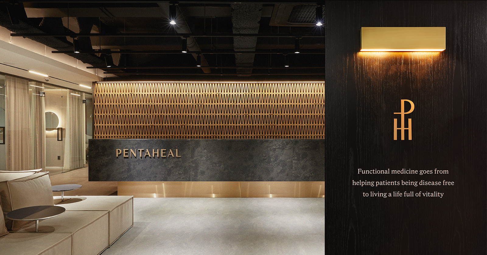
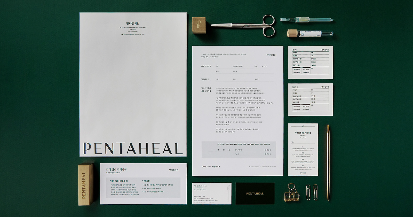
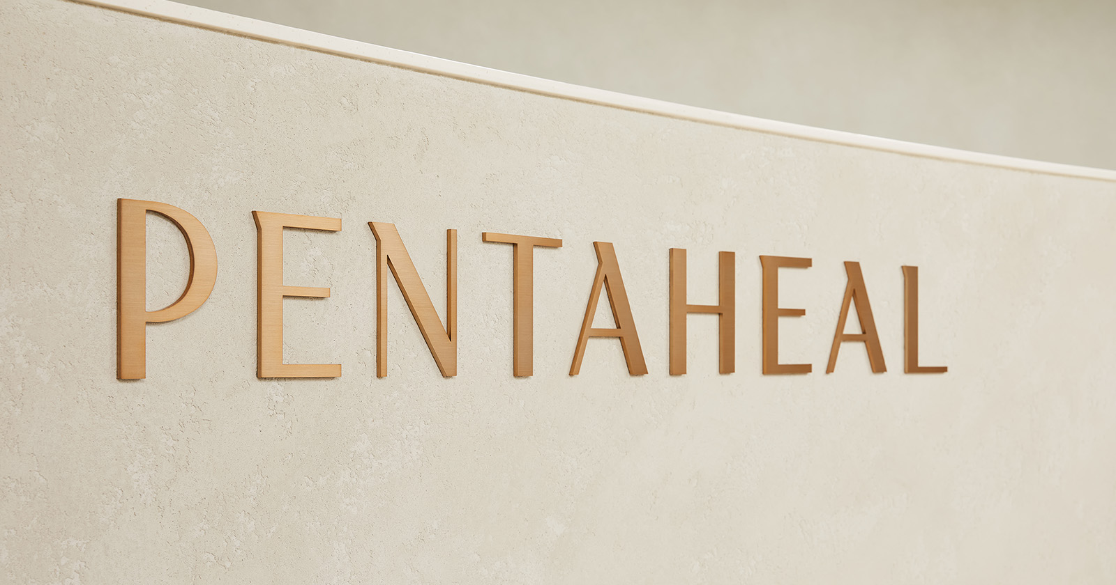
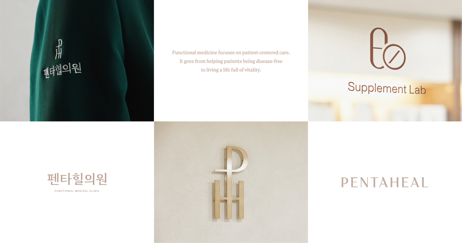
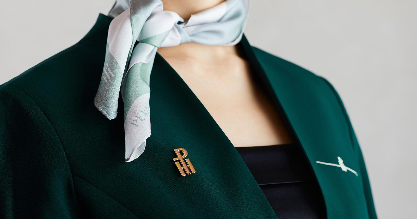
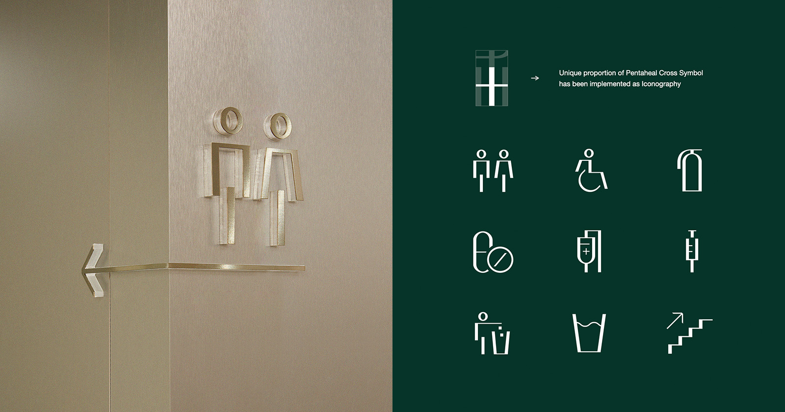
Conceived from the universal medical symbol 'Cross(+)', Eidetic proposed a solution that would maintain Pentaheal’s clinical image and improve the brand’s identity with better readability and suitability. The motif’s sprawling lines from the vertical and horizontal axis, express Pentaheal’s expandability within its service area and discipline. In doing this, we developed a consistent brand design that would deliver and communicate Pentaheal’s philosophy to the vast public.
- Global Market Research
- Brand Diagnostics
- Brand Identity & Application Development
- Customer Touchpoint Improvement
- Signature Moments